SOLshop
Simplified checkout and reduced the order time 4 times
About
SOLSHOP - group buy marketplace
Task
To simplify the process of designing a check and make it as seamless as possible for the user.
Goals
Increase the number of groups collected, reduce the number of "stuck" at the stage of ordering
Role
Senior Product Designer
Year
2024

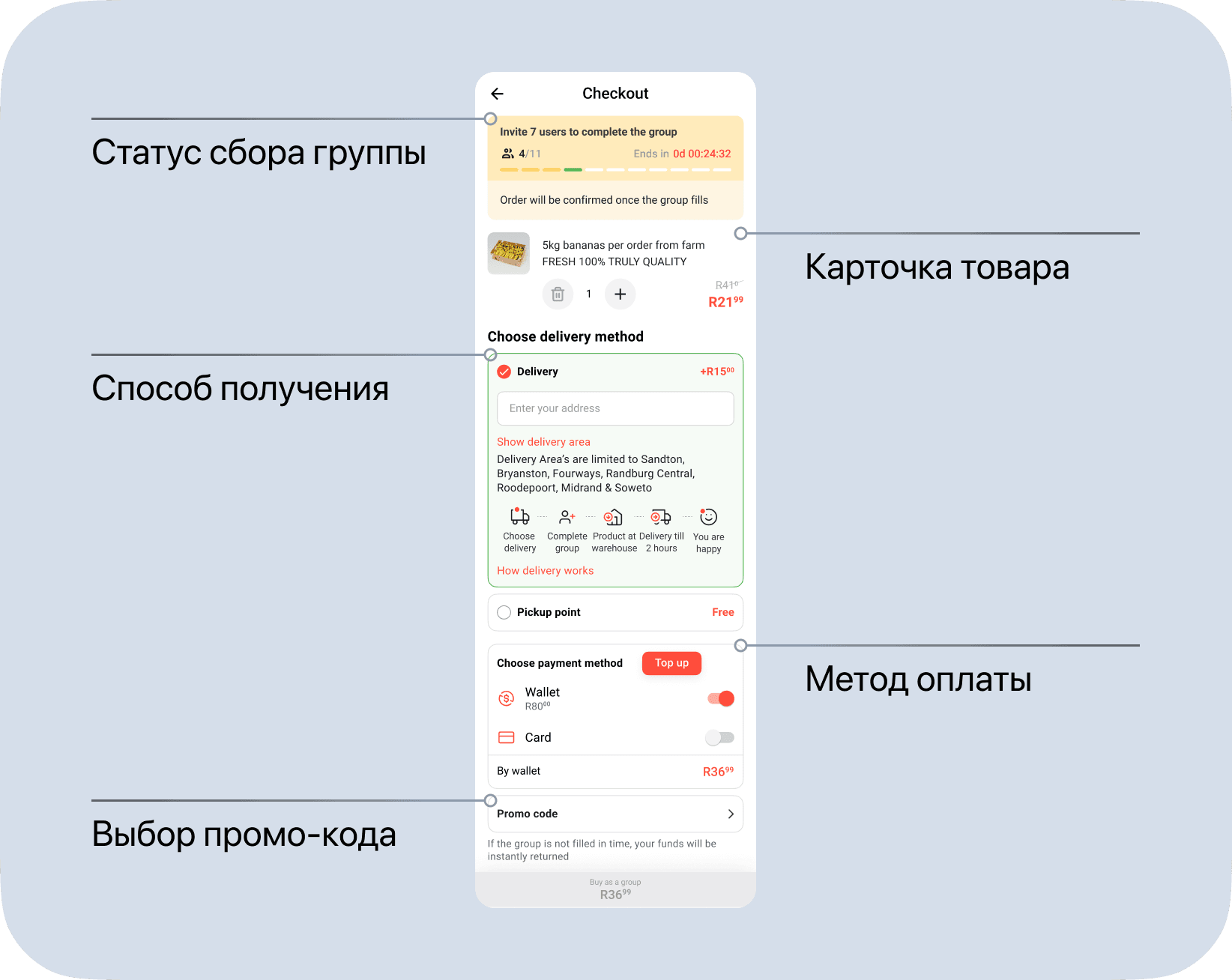
1. Process before
To fully understand where the hypothesis to simplify the checkout came from, we need to look at its current state: it’s bulky, overly colorful, and overloaded with information.4o
Group status;
Product card;
Delivery method selection — this affects the final price;
Payment method selection — wallet or card;
Promo code entry;
After pressing the button, the order is added to the order list.
It might seem like an easy fix — just group everything into logical steps, split it across 2–3 screens, and you’re done. But it’s not that simple. The business’s primary goal is to reduce the number of users who get “stuck” during checkout, and the core hypothesis is to create a VERY short and VERY fast checkout experience.
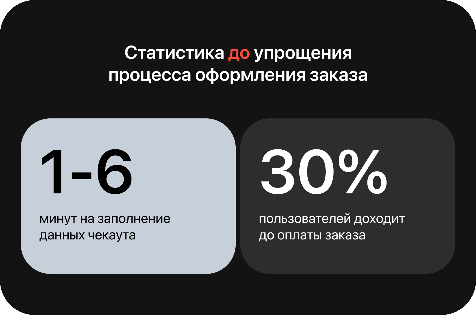
2. General statistics
Users spend anywhere from 1 to 6 minutes filling in all the required information.
Only 30% of users complete the payment.
3. How did you decide to simplify?
To test the hypothesis, I came up with two new user flows — both centered around integrating wallet-based payment.
Currently, the wallet can only be topped up via offline locations. In the new checkout flow, we’re introducing the ability to top up the wallet using a card.
Scenario #1
The user pays via wallet. If the balance is insufficient, they enter their card details, the wallet is topped up automatically, and the payment goes through. Delivery details are entered after the order is placed, from the “Orders” section. Delivery payment is also completed during the delivery method selection step.4o
No additional confirmations, no payment approval screens, no separate deduction steps — just a fast and seamless experience.

Scenario #2
The payment process remains the same. This flow differs from Scenario #1 in that the user enters delivery information upfront, during the order placement stage.

4. Live test
To determine which version performs better, we launched A/B tests on a live audience and compared the results.
Each scenario was shown to 100 unique users, and the decision was made based on the data collected from their interactions.
Scenario No. 1
Order speed:
Previously: 1–6 minutes
Now: 15 seconds to 1 minute
Completed payments:
Previously: 30%
Now: 45%
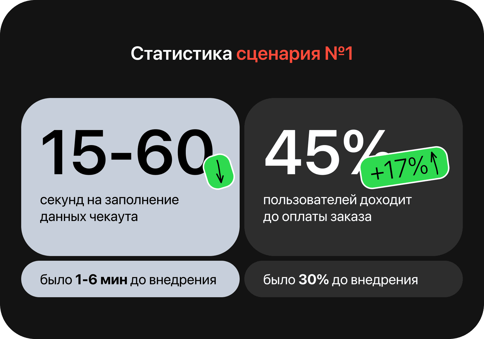
It’s important to note that at this stage, the user hasn’t yet selected a delivery method or completed delivery payment. After placing the order, they receive several push notifications at set intervals, reminding them to choose a delivery option. Deferring the delivery step had no negative impact on the overall stats — only one user contacted support with a related issue.4o
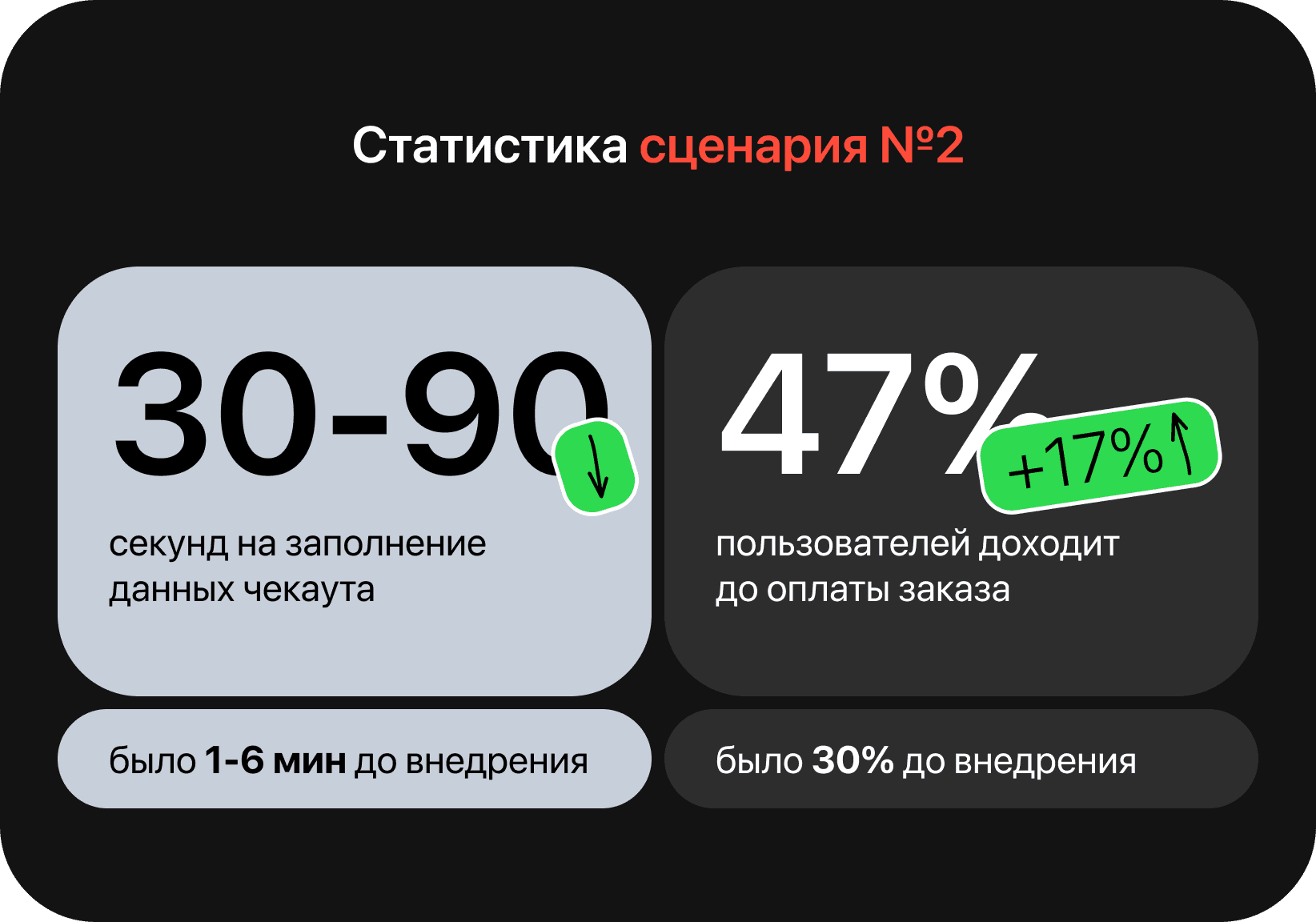
Scenario No. 2
Order speed:
Previously: 1–6 minutes
Now: 30 seconds to 1.5 minutes
Completed payments:
Previously: 30%
Now: 47%
Based on the test results, it was decided to roll out Scenario #1 as the primary checkout flow.
As a result, we achieved a 4× increase in order placement speed compared to the original flow.
And this is what the final scenario #2 looks like